How to interpret MAPE (simply explained)
MAPE (Mean Absolute Percentage Error) is a common regression machine learning metric, but it can be confusing to know how to interpret the values. In this post, I explain what MAPE is, how to interpret the values and walk through an example.
MAPE (Mean Absolute Percentage Error) is a common regression machine learning metric, but it can be confusing to know how to interpret the values. In this post, I explain what MAPE is, how to interpret the values and walk through an example.
What is MAPE?
Mean Absolute Percentage Error (MAPE) is the mean of all absolute percentage errors between the predicted and actual values.
It is a popular metric to use as it returns the error as a percentage, making it both easy for end users to understand and simple to compare model accuracy across use cases and datasets.
Formula for MAPE
The formula for calculating MAPE is as follows:
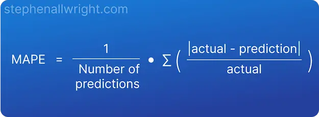
This formula helps us understand one of the important caveats when using MAPE. In order to calculate this metric, we need to divide the difference by the actual value. This means that if you have actual values close to or at 0 then your MAPE score will either receive a division by 0 error, or be extremely large. Therefore, it is advised to not use MAPE when you have actual values close to 0.
How to interpret MAPE
MAPE can be interpreted as the inverse of model accuracy, but more specifically as the average percentage difference between predictions and their intended targets in the dataset. For example, if your MAPE is 10% then your predictions are on average 10% away from the actual values they were aiming for.
MAPE value interpretation
Now that we know how to interpret the definition of MAPE, let's look at how to interpret the values themselves. It will be dependent upon your use case and dataset, but a general rule I follow is:
| MAPE | Interpretation |
|---|---|
| <10% | Very good |
| 10% - 20% | Good |
| 20% - 50% | OK |
| >50% | Not good |
How to interpret MAPE for time series forecasting
MAPE for time series forecasting can be interpreted as the average percentage error over all time periods in the dataset, specifically the average percentage difference between forecasts and their intended targets. For example, if your dataset is a year period broken down per day and your MAPE is 10%, then the average difference between the daily forecast and the actual over the whole year period is 10%.
Example of interpreting MAPE score
To better understand how to interpret MAPE, let’s look at an example where we are predicting the price of a house.
To start with, we need to calculate the absolute error and then the absolute percentage error for all of our predictions:
| Actual | Prediction | Absolute Difference | Absolute Percentage Difference |
|---|---|---|---|
| 100,000 | 105,000 | 5,000 | 5% |
| 150,000 | 140,000 | 10,000 | 6.7% |
| 250,000 | 270,000 | 20,000 | 8% |
| 120,000 | 121,000 | 1,000 | 0.8% |
From this, we can take the mean of all the values to come to our MAPE value.
MAPE = (5 + 6.7 + 8 + 0.8) / 4 = 5.2%
By using our interpretation table from before, we can say that the interpretation of this value is that on average our predictions are 5.2% away from the targets, which is commonly seen as a very good value.
Related articles
Metric calculators
Metric comparisons
RMSE vs MAPE, which is the best regression metric?
MAE vs MAPE, which is best?
Regression metrics
Interpretation of R Squared
Interpretation of RMSE
Interpretation of MSE
Interpretation of MAE
References